2020 has been dominated by the Covid-19 pandemic no matter where you live in the world. Using data from the Our World in Data and Covid Tracking Project APIs I compare where I currently live (on the Maryland side of the DC/Maryland border) with where I used to live (Ireland).
Comparing Cases and Deaths in Washington DC, Maryland, and Ireland
I control for population by presenting all metrics in terms of per million population. DC has suffered the most, its 881 deaths/million is more than double Ireland’s death rate which currently stands at 363 deaths/million.
Ireland effectively got its case numbers down to near zero from about mid June but there has been a slight rise in September. Meanwhile DC and Maryland never got below about 50 new cases/million/day and even saw a resurgence in case numbers in July but trended down again in August – thankfully the death rates have continued to decline since their peaks in late April and early May. Ireland’s deaths had a sharp drop off in early May. DC and Maryland peaked in deaths around the same time as Ireland but DC had a much higher peak and both DC and Maryland had a more gradual descent from their peak deaths resulting in a higher overall death count.
R code to create an interactive version of this graphic can be downloaded from my Google Drive.
Supervised learning – we are training the model on a specific target variable. We are looking to identify the relationship between the target variable and potential predictor variables. Examples discussed in earlier blog posts include: random forests, loess and linear regression, naive Bayes
Unsupervised learning – there is no target variable. We apply an algorithm to uncover relationships between variables in the data. Examples include: hierarchical clustering, k-means clustering, anomaly detection.
I had a graphic in A very brief introduction to statistics (slide 8) which highlighted the distinction within supervised learning between regression and classification. Here it is again.
Top of the list of classification algorithms on the left is good old “logistic regression” developed by David Cox in 1958. There is an inside joke in the data science world that goes something like this:
Data scientists love to try out many different kinds of models before eventually implementing logistic regression in production!
It’s funny cos it’s true! Well, kinda true. Logistic regression is popular because it is robust (in that it tends to give a pretty good answer even if the logistic regression assumptions are not strictly adhered to) and it is extremely simple to build in production (the end result is just a simple formula which is easy compared to the complex output of a neural net or a random forest). So you need to make a really strong case to justify moving away from the tried and trusted logistic regression approach.
Without further ado, let’s jump into an example!
Loan Application Example
Say we had the following loan application data. These loan applications have been reviewed and approved/denied by lending experts. As an experiment, your boss wants to develop a quick response loan process for small loan requests and she asks you to develop a model.
Correlation Analysis
In this data set it looks like Credit Score and Loan Amount are two useful variables that influence the outcome of a loan decision. Let’s run a quick analysis to see how they correlate with loan decisions.
Credit score has a positive correlation, 0.689, with loan decision – that makes sense – the higher your credit score, the greater your chances of being approved for a loan. But loan amount has a negative correlation, -0.500, with loan decision – this also makes sense – most banks will probably lend anyone 200 bucks without much fuss but if I ask for $50,000 that’s a different story!
Simple Model – One Predictor Variable
Credit score is most highly correlated with loan decision so let’s first build a logistic regression model using only credit score as a predictor.
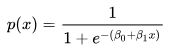
and the coefficients can be deduced from the logistic regression summary
where β0 = -17.51205 and β1 = 0.02687.
But perhaps a more intuitive way of writing the same function is as follows:
In our example: x0 = (-β0 / β1) = (-17.51205 / 0.02687) = 651.7, and L = 1.0, and k = 0.02687. I prefer this form of the equation because it more easily relates to the chart where we can clearly see that at a credit score of about 651.7 the probability of a loan being approved is precisely 0.5. If credit score was the only data you had and someone demanded a yes/no answer from you, then you could reduce the model to:
IF credit score ≥ 652 THEN approve ELSE deny
Of course it would be a shame to reduce the continuous output of the logistic regression to a binary output. Any savvy lender should be interested in the distinction between a 0.51 probability vs a 0.99 probability – perhaps someone with a high credit score gets a lower rate of interest and vice-versa rather than a crude approve/deny outcome.
Model Performance with One Predictor Variable
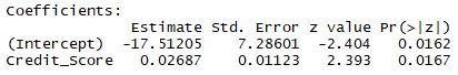
The performance of this model can be assessed by looking at the confusion matrix output and/or by coloring in the classifications on the chart.
The confusion matrix terms can be a little (ahem) confusing, it’s best not to get too bogged down with them as I discussed here but looking at the balanced accuracy is a decent rule-of-thumb.
In other domains you may want to pay more careful attention if there is a significant real cost difference between false positives and false negatives. For example, say you have a sophisticated device to detect land mines, the cost of a false negative is very high compared to the cost of a false positive.
On the chart below we can compare the classification results to the confusion matrix and confirm that the model does indeed have 2 false positives and 2 false negatives.
Slightly More Complex Model – Two Variables
Let’s now go back and include the second variable: Loan Amount. Remember Loan Amount had a negative correlation – the larger the loan amount, the lower the likelihood of approval.
Because we have an extra dimension in this chart, we use different shapes to indicate whether a loan was approved or denied. We can see there are still two false negatives but there is now only one false positive – so the model has improved! The balanced accuracy has increased from 0.80 to 0.85 – yaaay! 🙂
Visualizing the Logistic Regression Partition
We can sorta make out the partition when we look at the chart above but with only 20 data points it’s not very clear. For a clearer visual of the partition we can flood the space with hundreds of dummy data points and produce a much clearer divide.
We used a continuous color scale here to show how the points close to the midpoint of the sigmoid curve have a less clear classification, i.e. the probability is around 0.5. But we still can’t really see the curve in this visual – we have to imagine the orange points in the bottom right are higher (probability) than the blue points in the top left and all of the points are sitting atop a sigmoidal plane and the inflection point of the sigmoid runs along the partition where prediction probability = 0.5.
Using a 3-dimensional plot we can clearly see the distinctive sigmoid curve slicing through the space.
It is important to note that you don’t need to generate any of these visualizations when doing logistic regression and when you have more than 2 variables it becomes very difficult to effectively visualize. However, I have found that going through an exercise like this helps me achieve a richer understanding of how a logistic regression works and what it does. The better we understand the tools we use, the better craftspeople we are.
The R code for this analysis is available here and the (completely fabricated) data is available here.
The FizzBuzz test is a simple programming challenge used to weed out “weak” computer programmers in a a job interview. The earliest reference I can find for FizzBuzz is here and the task is as follows:
Write a program that prints the numbers from 1 to 100. But for multiples of three print “Fizz” instead of the number and for the multiples of five print “Buzz”. For numbers which are multiples of both three and five print “FizzBuzz”.
Sounds simple, right! And it is. I came across this particular challenge a few weeks ago and I immediately coded it up in R. It probably took me about 5-10 minutes. When you actually attempt it you’ll notice it does require a little bit of thought – which is why it is such a good test! I quickly recognized a solution that would include a for loop and a couple of if statements but when you code the if statements in the order the question is asked you hit a snag:
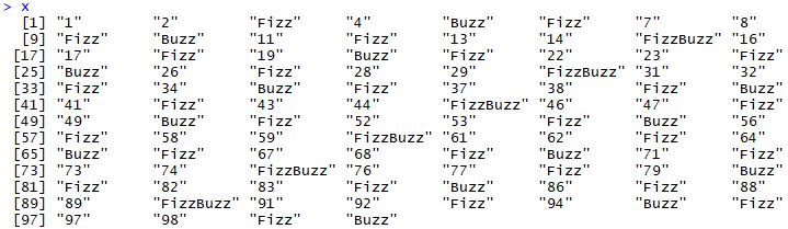
x <- 1:100
for(i in 1:100) {
if (i %% 3 == 0) { x[i] <- “Fizz” } # This is easy!
else if (i %% 5 == 0) { x[i] <- “Buzz” } # Looking good, I’m a shoo-in for this job!
else if (i %% 15 == 0) { x[i] <- “FizzBuzz” } } # Uh oh, this last statement won’t be executed 😦
x # Doh! Not a FizzBuzz in sight!
Trial and Error
So attempt one is a dud but I think this is ok. That’s how I code, that’s how the best coders I know code: trial and error. Try something, note the results, figure out what needs fixing and go again. And this approach is perfectly acceptable with real problems and real data – so long as you’re working offline in sandbox type environments and carrying out all necessary testing.
Note: Trial and error is not a substitute for thinking, but rather a means of avoiding paralysis by analysis. Have a little think, and then so long as you’re not breaking anything, just give it a go and see how the results look. Trying to plan everything out to a T before commencing can be paralyzing – not to mention boring!
Note on the note: Sometimes we do want to give more careful thought before acting, it depends on the risks involved as I’ve discussed here.
Take Two
So I looked at the results and figured, ok, how about I check for the “FizzBuzz” condition first, i.e. numbers which are multiples of both three and five. And hey presto, that simple tweak produces the desired result!
x <- 1:100
for(i in 1:100) {
if (i %% 15 == 0) { x[i] <- “FizzBuzz” }
else if (i %% 3 == 0) { x[i] <- “Fizz” }
else if (i %% 5 == 0) { x[i] <- “Buzz” } }
x
Is FizzBuzz a good thing?
There have been many blog posts from eminent programmers on the pros and cons of asking these kinds of “whiteboard coding” questions in interviews. Here is a good example and skimming through the comments is worthwhile too as many practitioners weigh in. Personally, I think it is worthwhile to ask something like FizzBuzz. When I am interviewing people who claim to have R and SQL skills (and the role requires these skills) I might ask them to tell me what libraries or functions or commands they commonly use and I think I can gauge from their response whether they actually code or not.
For example, if they mention google/stackoverflow in their answer I’m comfortable that they know what they’re talking about. A less confident person, someone who is trying to pull the wool over my eyes, might not feel comfortable admitting that they have to use google or stackoverflow to find answers.
Interestingly, when I’ve been on the other side of the interview desk, I’ve never been asked a FizzBuzz question. The zingers I have been asked typically pertain to statistics, e.g. what’s a p-value, what’s a logistic regression model, measures of classification error, etc. But I could see why “whiteboarding” is more of a thing in the software development world as they probably spend a greater amount of time coding than a data scientist does.
Risk can mean different things in different domains but this simple formula is a pretty good rule-of-thumb:
Risk = Likelihood x Impact
Before I became a data scientist I was a civil engineer for the first 6 years of my career and I have to admit the civil engineering industry was better at risk assessment than all the industries I’ve seen since then, e.g. government, fraud, insurance, finance, etc. I think this is because in the construction industry poor risk assessment leads to injuries and even deaths – that can focus minds and lead to innovation such as risk matrices and other risk assessment tools.
Risk Assessment in Civil Engineering
A good risk assessment involves identifying hazards (things that have the potential to cause harm) and then scoring (often something like a 1-9 scale is used) them under likelihood and impact. For example hazards on a construction site might be:
A buried high voltage power line near the site might have a low to medium likelihood (say 3 out of 9) of affecting us if we’re not planning on digging in the vicinity but the impact is very high (say 9 out of 9) since inadvertently striking the line could lead to death. Risk = 3 x 9 = 27
Another example could be the renovation of an old building. A low doorway has a high likelihood (say 7) of someone banging their head but the impact of a little bump on the head is not so high (say 2). Risk = 7 x 2 = 14
The above is a very simple example but a large complex construction project could have hundreds of hazards that need to be assessed. When all the risks have been estimated the next step is to eliminate risks where possible or at the very least to mitigate the risk. For example, the low doorway, if you can make it higher, the likelihood of an incident occurring goes to zero. But if you’re not able to alter the doorway then mitigation measures might include adding padding to the doorway (reduces impact), adding high visibility warning tape (reduces likelihood) and/or requiring personnel to wear hard hats (reduces impact).
Risk Assessment in Fraud Detection
NOTE: This only pertains to two contracts I’ve worked on and is not representative of the fraud detection industry in general.
Unfortunately, I have seen risk conflated with likelihood on TWO separate fraud detection contracts, i.e. the predictive models spit out a likelihood (or probability) and this is reported as the risk with no account taken of the impact. For example, two entities might have a similar likelihood of fraud but one is a large multi-million dollar enterprise while the other is a small operation in the thousands of dollars. Obviously the large dollar enterprise is riskier because of the larger impact of its potential fraud.
What to do? It’s tricky to come into a space where the client and other data practitioners have been working for years and they’re using terms a particular way! Telling everyone they’re wrong ain’t gonna work! In one instance I came up with a “new” metric and called it the “risk impact score” and it was simply the product of the likelihood (probability that they were incorrectly calling risk) and the impact (the potential dollars at risk). Another (less desirable) option can be to somehow rejig the predictive model so that the potential impact is baked in.
So, big deal, who cares?
In a world of limited resources an accurate risk assessment is essential for an effective risk prioritization. If we have an investigator/auditor/agent available to pick up a new case we probably want to assign the riskiest case – the case that gets us most bang for our buck. Of course other things can matter too such as the expected difficulty level (likelihood of catching or stopping the fraud) of a case or a political desire to redirect resources. Either way, as data practitioners it is incumbent on us to utilize the available data, take account of the project goals and communicate our analysis in a way that best serves the client.
I love puzzles so I took a stab at this using two different approaches. You can download my Excel spreadsheet solution here.
Approach 1: Probability Theory
I recognized the problem as being an example of binomial probability which I used previously in the birthday problem. We want to know the probability of having x successes from N trials where the probability Π of success in any one trial is constant. It’s a little trickier because there are 16 squares on the grid, so to begin I simplify it by calculating the probability of getting three darts in one specific square.
Note: It wasn’t clear to me whether we should calculate for exactly three darts in a square or at least three darts in a square. I did both as the extra computation is trivial.
x = 3 ; N = 8 ; Π = 1/16 = 0.0625 – plug these numbers into the following formula and you should get 0.0099, that is the probability of getting exactly 3 darts in a specific square, e.g. the top left square.
To compute the probability of getting exactly three darts in any square, simply multiply by 16 and you get 0.1584. Now to extend this and compute the probability of getting at least three darts in any square, simply repeat the above for x = 4, 5, 6, 7, 8 and sum the answers together. Or sum the probabilities for x = 0, 1, 2 and subtract from 1. Either way you should get an answer of 0.1723, that is a 17% chance of getting at least three darts in any square.
Approach 2: Simulation
Let’s say you understand the problem well but you’re not so hot at probability (that’s ok by the way, probability is hard, I’ve regularly seen experts make mistakes!) BUT you can code. If you can code you can randomly simulate the problem over and over again and just see how the results pan out. Heck, you don’t even need code per se, I did this in Excel – download my spreadsheet here. The simulated results matched the theory pretty well – 0.1542 and 0.1699 for exactly 3 darts and at least 3 darts respectively.
Closing Thoughts
Doing fun puzzles like this is a great way to stay sharp statistically, think of it like a work out in the gym. And even if you don’t solve the puzzle, trying to solve it before peeking at the solution is how you expand your statistical knowledge. I recommend looking at all the replies to the initial tweet to see how some people got it wrong and how others got it right. And remember there can be multiple possible solution methods. I’ve spoken previously about the importance of tackling problems in more than one way in the Monty Hall Problem. It’s good to have these different approaches in your arsenal because:
You never know when you’ll need them.
Our knowledge is solidified when we understand a problem from different angles.
If we’re not 100% confident in our answer, another approach can serve as a validation.
Depending on the audience you may have to try different explanations to ensure they understand.
PS: Things can get a little funky when you start considering the cases where there are three darts in more than one square. I ignored that here but it does explain the slight difference between the theoretical solution and the simulated solution.
This is not a post about young lovers lacking in worldly wisdom – that would be naive baes. This is about an elegant machine learning classification algorithm – Naive Bayes classifiers are a family of simple probabilistic classifiers based on applying Bayes’ theorem with strong (naive) independence assumptions between the features. I have previously applied Bayes’ Theorem to solve the Monty Hall problem.
Reminder of Bayes Rule: P(A | B) = P(B | A) * P(A) / P(B)
P(A) and P(B) are the probabilities of events A and B respectively
P(A | B) is the probability of event A given event B is true
P(B | A) is the probability of event B given event A is true
Still not clear? Ok, the formula can be rewritten in English as: “The posterior is equal to the likelihood times the prior divided by the evidence” Clear as mud, eh? Ok, I’ll try again! The posterior probability is easy enough, that’s what we’re looking for, it’s what we want to learn. After we analyze the data our posterior probability should be our best guess of the classification. Conversely, the prior probability is our best guess before we collect any data, the conventional prevailing wisdom if you will. The nice thing about a classification problem is that we have a fixed set of outcomes so the computation of probabilities becomes a little easier as we’ll see.
Let’s use the famous weather/golf data set to demonstrate an example. It’s only 14 rows so I can list them here as is:
Outlook
Temperature
Humidity
Windy
Play
overcast
hot
high
FALSE
yes
overcast
cool
normal
TRUE
yes
overcast
mild
high
TRUE
yes
overcast
hot
normal
FALSE
yes
rainy
mild
high
FALSE
yes
rainy
cool
normal
FALSE
yes
rainy
cool
normal
TRUE
no
rainy
mild
normal
FALSE
yes
rainy
mild
high
TRUE
no
sunny
hot
high
FALSE
no
sunny
hot
high
TRUE
no
sunny
mild
high
FALSE
no
sunny
cool
normal
FALSE
yes
sunny
mild
normal
TRUE
yes
It’s pretty obvious what’s going on in this data. The first four variables (outlook, temperature, humidity, windy) describe the weather. The last variable (play) is our target variable, it tells me whether or not my mother played golf given those weather conditions. We can use this training data to develop a Naive Bayes classification model to predict if my mother will play golf given certain weather conditions.
Step 1: Build contingency tables for each variable (tip: this is just an Excel pivot table or a cross tab in SAS or R)
Go through each variable and produce a summary table like so:
Played Golf
Outlook
no
yes
overcast
0%
44%
rainy
40%
33%
sunny
60%
22%
Do the same for the target variable which is no (36%) and yes (64%). Think of these two numbers as your prior probability. It is your best guess of the outcome without any other supporting evidence. So if someone asks me will my mother play golf on a day but they have told me nothing about the weather, my best guess is simply yes she will play golf with a probability of 64%. But let’s say I peek at the weather forecast for this Saturday and I see that the day will be SUNNY (outlook), MILD (temperature), HIGH (humidity) and TRUE (windy). Will my mother play golf on this day? Let’s use Naive Bayes classification to predict the outcome.
Step 2: Compute the likelihood L(yes) for test data
Test data day: SUNNY (outlook), MILD (temperature), HIGH (humidity) and TRUE (windy). Let’s first compute the likelihood that yes mother will play golf. Go grab the numbers from the tables we created in Step 1:
Therefore I can predict, with a probability of 86%, that my mother will not play golf this Saturday based on her previous playing history and on the weather forecast – SUNNY (outlook), MILD (temperature), HIGH (humidity) and TRUE (windy).
Closing thoughts
Naive Bayes is so-called because there is an assumption that the classifiers are independent of one another. Even though this is often not the case, the model tends to perform pretty well anyway. If you come across new data later on, great, you can simply chain it onto what you already have, i.e. each time you compute a posterior probability you can go on to use it as the prior probability with new variables.
You might have noticed that all the input variables are categorical – that is by design. But do not fret if you have numerical variables in your data, it is easy to convert them to categorical variables using expert knowledge, e.g. temperature less than 70 is cool, higher than 80 is hot and in between is mild. Or you could bin your variables automatically using percentiles or deciles or something like that. There are even ways to handle numerical data directly in Naive Bayes classification but it’s more convoluted and does require more assumptions, e.g. normally distributed variables. Personally, I prefer to stick to categorical variables with Naive Bayes because fewer assumptions is always desirable!
Check out the 5 minute video here that largely inspired this blog post.
I’m not usually a fan of infographics (not to be mistaken with data visualization which can be awesome!) but this baseball infographic is a lovely intro to predicting with Bayes.
And here is a very simple short example if you want to come at this again with different data – movie data in this case!
This blog post is of course about understanding how Naive Bayes classification works but if you are doing Naive Bayes classification with real life larger data sets then you’ll probably want to use R and the e1071 package or similar.
Bar charts beat pie charts almost every time – I say almost because I am open to being convinced … but I won’t be holding my breath.
Disadvantages of pie charts:
– pie slices ranking is difficult to see even if attempted
– rely on color which is an extra level of mental effort for the viewer to process
– colors are useless if printed in black and white
– difficult to visually assess differences between slices
– 3-D is worse because it literally makes the nearest slice look bigger than it should be
Advantages of bar charts:
– easier to read
– no need for a legend
– we can rank the bars easily and clearly
– easy to visually assess difference
All that being said, data visualization is a matter of taste and personal preference does come into it. At the end of the day it’s about how best we can communicate our message. I wouldn’t dare say we should never use pie charts but personally I tend to avoid them.
The Monty Hall problem is a classic probability conundrum which on the surface seems trivially simple but, alas, our intuition can lead us to the wrong answer. Full disclosure: I got it wrong when I first saw it! Here is the short Wikipedia description of the problem:
Suppose you’re on a game show, and you’re given the choice of three doors: Behind one door is a car; behind the others, goats. You pick a door, say No. 1, and the host, who knows what’s behind the doors, opens another door, say No. 3, which has a goat. He then says to you, “Do you want to pick door No. 2?” Is it to your advantage to switch your choice?
On the surface the Monty Hall problem seems trivially simple: 3 doors, 1 car, 2 goats, pick 1, host opens 1, then choose to stick or switch
If you haven’t seen the problem before, have a guess now before reading on – what would you do, stick or switch? My instinctive first intuition was that it does not matter if I stick or switch. Two doors unopened, one car, that’s a 50:50 chance right there. Was I right?
That’s the generic form of Bayes’ Theorem. For our specific Monty Hall problem let’s define the discrete events that are in play:
P(A) = P(B) = P(C) = 1/3 = the unconditional probability that the car is behind a particular door.
Note I am using upper case notation for our choice of door and as you see below I will use lower case to denote the door that Monty chooses to open.
P(a) = P(b) = P(c) = 1/2 = the unconditional probability that Monty will open a particular door. Monty will only have a choice of 2 doors because he is obviously not going to open the door you have selected.
So let’s say we choose door A initially. Remember we do not know what is behind any of the doors – but Monty knows. Monty will now open door b or c. Let’s say he opens door b. We now have to decide if we want to stick with door A or switch our choice to door C. Let’s use Bayes’ Theorem to work out the probability that the car is behind door A.
P(A|b) is the probability that the car is behind door A given Monty opens door b – this is what we want to compute, i.e. the probability of winning if we stick with door A
P(b|A) is the probability Monty will open door b given the car is behind door A. This probability is 1/2. Think about it, if Monty knows the car is behind door A, and we have selected door A, then he can choose to open door b or door c with equal probability of 1/2
P(A), the unconditional probability that the car is behind door A, is equal to 1/3
P(b), the unconditional probability that Monty opens door b, is equal to 1/2
Hmmm, my intuition said 50:50 but the math says I only have a 1/3 chance of winning if I stick with door A. But that means I have a 2/3 chance of winning if I switch to door C. Let’s work it out and see.
P(C|b) is the probability that the car is behind door C given Monty opens door b – this is what we want to compute, i.e. the probability of winning if we switch to door C
P(b|C) is the probability Monty will open door b given the car is behind door C. This probability is 1. Think about it, if Monty knows the car is behind door C, and we have selected door A, then he has no choice but to open door b
P(C), the unconditional probability that the car is behind door C, is equal to 1/3
P(b), the unconditional probability that Monty opens door b, is equal to 1/2
There it is, we have a 2/3 chance of winning if we switch to door C and only a 1/3 chance if we stick with door A.
Method 2: Write code to randomly simulate the problem many times
Bayes’ Rule is itself not the most intuitive formula so maybe we are still not satisfied with the answer. We can simulate the problem in R – grab my R code here to reproduce this graphic – by simulate I mean replay the game randomly many times and compare the sticking strategy with the switching strategy. Look at the results in the animation below and notice how as the number of iterations increase the probability of success converges on 1/3 if we stick with first choice every time and it converges on 2/3 if we switch every time.
When we simulate the problem many times we see the two strategies (always stick vs always switch) converge on 1/3 and 2/3 respectively just as we had calculated using Bayes’ Theorem
Simulating a problem like this is a great way of verifying your math. Or sometimes, if you’re stuck in a rut and struggling with the math, you can simulate the problem first and then work backwards towards an understanding of the math. It’s important to have both tools, math/statistics and the ability to code, in your data science arsenal.
Method 3: Stop and think before Monty distracts you
You have selected one of three doors. You know that Monty is about to open one of the two remaining doors to show you a goat. Before Monty does this, ask yourself, which would you rather? Stick with the one door you have selected or have both of the two remaining doors. Yes, both, because effectively that is your choice: stick with your first choice or have both of the other doors.
The Monty Hall problem can be reduced to this if we pause and think about the situation immediately before Monty opens a door to reveal a goat
Two doors or one, I know what I’d pick!
Parting thoughts
Coming at a problem from different angles: math, code, visualizations, etc, can help us out of a mental rut and/or reassure us by verifying our solutions. On the flip side, even when we ourselves fully understand a solution, we often have to explain it to a client, a manager, a decision maker or a young colleague who we are trying to teach. Therefore it is always a valuable exercise to tackle a problem in various ways and to be comfortable explaining it from different angles. Don’t stop here, google Monty Hall and you will find many other varied and interesting explanations of the Monty Hall problem.
Type 1 errors, type 2 errors, sensitivity, specificity, etc. As any undergrad knows statistical nomenclature can give you a headache. I still see experts in the field get confused over what is the difference between a false positive rate and a false discovery rate. I’m here to tell you, don’t worry, it’s not your fault, we all struggle to remember these horribly named statistics.
Hover over the cells to see the cell description in the comment box and, if you’re like me, reference this every time you need to compute these statistics just to be sure!
Comparison of real estate costs across different regions presents a challenge because location has such a large impact on rent and operation & maintenance (O&M) costs. This large variance in costs makes it difficult for organizations to compare costs across regions.
“There are three things that matter in property: Location, location, location!” British property tycoon, Lord Harold Samuel
For example, imagine two federal agencies, each with 100 buildings spread across the US. Due to their respective missions, agency A has many offices in rural areas, while agency B has many downtown office locations in major US cities.
Agency B has higher rent costs than agency A. This cost difference is largely explained by location – agency B offices are typically in downtown locations whereas agency A offices are often in rural areas. To truly compare costs we need to control for location.
However, we cannot conclude from this picture that agency B is overspending on rent. We can only claim agency B is overspending if we can somehow control for the explanatory variable that is location.
Naïve solution: Filter to a particular location, e.g. county, city, zipcode, etc, and compare costs between federal agencies in that location only. For example we could compare rents between office buildings in downtown Raleigh, NC. This gives us a good comparison at a micro level but we lose the macro nationwide picture. Filtering through every region one by one to view the results is not a serious option when there are thousands of different locations.
I once worked with a client that had exactly this problem. Whenever an effort was made to compare costs between agencies, it was always possible (inevitable even) for agencies to claim geography as a legitimate excuse for apparent high costs. I came up with a novel approach for comparing costs at an overall national level while controlling for geographic variation in costs. Here is a snippet of some dummy data to demonstrate this example (full dummy data set available here):
Agency
Zip
Sqft_per_zip
Annual_Rent_per_zip ($/yr)
G
79101
8,192
33,401
D
94101
24,351
99,909
A
70801
17,076
70,436
A
87701
25,294
106,205
D
87701
16,505
70,275
A
24000
3,465
14,986
As usual I make the full dummy data set available here and you can access my R code here. The algorithm is described below in plain English:
For agency X, compute the summary statistic at the local level, i.e. cost per sqft in each zip code.
Omit agency X from the data and compute the summary statistic again, i.e. cost per sqft for all other agencies except X in each zip code.
Using the results from steps 1 and 2, compute the difference in cost in each zip code. This tells us agency X’s net spend vs other agencies in each zip code.
Repeat steps 1 to 3 for all other agencies.
The visualization is key to the power of this method of cost comparison.
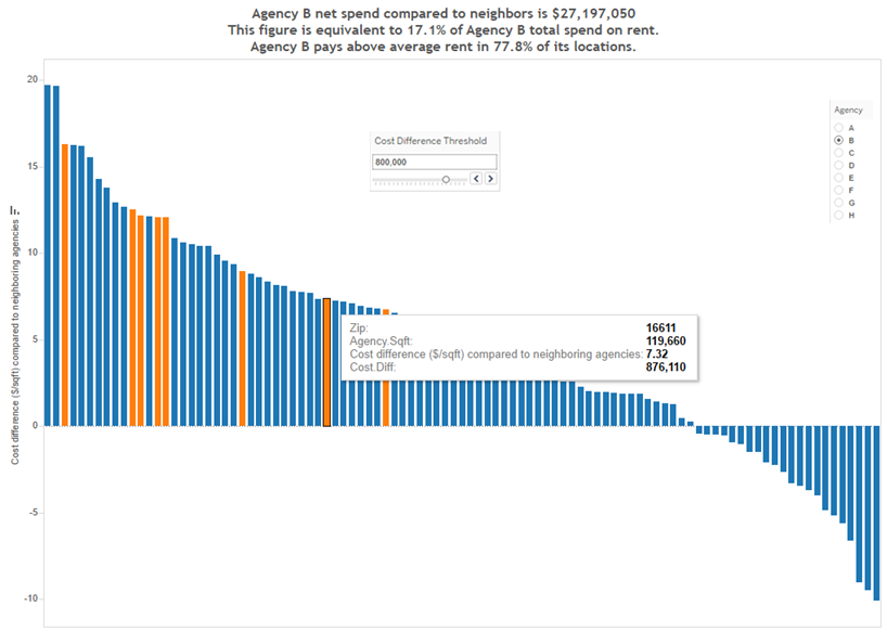
Screenshot from Tableau workbook. At a glance we can see Agency B is generally paying more than its neighbors in rent. And we can see which zip codes could be targeted for cost savings.
This plot could have been generated in R but my client liked the interactive dashboards available in Tableau so that is what we used. You can download Tableau Reader for free from here and then you can download my Tableau workbook from here. There is a lot of useful information in this graphic and here is a brief summary of what you are looking at:
The height of each bar represents the cost difference between what the agency pays and what neighboring agencies pay in the same zip code. If a bar height is greater than zero, the agency pays more than neighboring agencies for rent. If a bar height is less than zero, the agency pays less than neighboring agencies. If a bar has zero height, the agency is paying the same average price as its neighbors in that zip code.
There is useful summary information in the chart title. The first line indicates the total net cost difference paid by the agency across all zip codes. In the second title line, the net spend is put into context as a percentage of total agency rent costs. The third title line indicates the percentage of zip codes in which the agency is paying more than its neighbors – this reflects the crossover point on the chart, where the bars go from positive to negative.
There is a filter to select the agency of your choice and a cost threshold filter can be applied to highlight (in orange) zip codes where agency net spend is especially high, e.g. a $1/sqft net spend in a zip code where the agency has 1 million sqft is costing more than a $5/sqft net spend in a zip code where the agency has only 20,000 sqft.
The tool tip gives you additional detailed information on each zip code as you hover over each bar. In this screenshot zip code 16611 is highlighted for agency B.
At a glance we get a macro and micro picture of how an agency’s costs compare to its peers while controlling for location! This approach to localized cost comparison provided stakeholders with a powerful tool to identify which agencies are overspending and, moreover, in precisely which zip codes they are overspending the most.
Once again, the R code is available here, the data (note this is only simulated data) is here and the Tableau workbook is here. To view the Tableau workbook you’ll need Tableau Reader which is available for free download here.