Anomaly detection with Benford’s Law

Benford’s Law: the principle that in any large, randomly produced set of natural numbers, such as tables of logarithms or corporate sales statistics, around 30 percent will begin with the digit 1, 18 percent with 2, and so on, with the smallest percentage beginning with 9. The law is applied in analyzing the validity of statistics and financial records. (from Google)

Benford’s Law can be used to detect anomalous results. Detecting anomalies is important in tax, insurance and scientific fraud detection.

In this example we are analyzing daily sales data from 11 Widgets Inc. stores. The board suspects some stores might be fabricating sales numbers. The only way to prove it is via a full audit of a store’s accounts. Auditing is expensive and so the board asked me to identify one store to audit.

We have 365 days of sales data for each of 11 stores – the data can be viewed here. In R I used the substring function to get the first digit from every day of sales for every store – full R script available here. Not every first digit distribution follows Benford’s Law but many do. It was clear from the plots that Benford’s Law was applicable on this occasion.

Benford G
The distribution of first digits from daily sales in Store G (orange bars) follows Benford’s Law (blue dots) quite well

By plotting the observed distribution of first digits for daily sales from each store against the expected distribution we can identify which store veers furthest from the expected distribution. Visually, we can see that the sales numbers from Store K might be worth auditing.

Benford K
The distribution of first digits from daily sales in Store K (orange bars) do not follow Benford’s Law quite so well

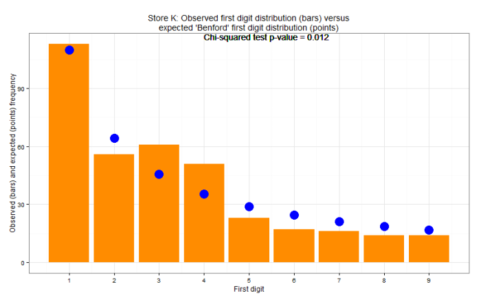
To augment this analysis and provide a more objective output a chi-squared test was carried out for each store. The chi-squared test is used to determine whether there is a significant difference between the expected frequencies and the observed frequencies. A lower chi-squared test p-value indicates a more anomalous distribution of first digits. Store K was audited and eventually they admitted to randomly generating sales numbers for many days during the year.

Note that disagreement with Benford’s Law does not prove anything. It merely offers a hint. A full audit of Store K was still necessary to prove any wrongdoing.

In this example we saw how data analytics identified which store was most likely to be the culprit thus avoiding audits of multiple stores. That’s what good analytics is about – the art and science of better.

Big data, big deal

An old blogpost of mine from 2014 when I worked at an energy management company. Below is my original (shorter and better) version. Big data guff that the marketing team added in has been crossed out!

When I first told friends and family that I was going back to school to study analytics, everyone kept asking, “Analytics? What’s that?” Fast forward a few years and data analytics is everywhere – often prefixed with the word BIG! So what drew me to the sexiest job of the 21stcentury? The exponential rise in digital data means there is a corresponding demand for people, organizations and tools that can harness that data and deliver insight. GridPoint is such an organization and GridPoint Energy Manager is that tool.
 
That word, insight, is a critical and sometimes neglected piece of the big data puzzle. Collecting data is relatively straightforward, but the results are complex. In fact, WIRED reports that researchers at the University of California at Berkeley discovered that five quintillion bytes of data are produced every two days! Here at GridPoint, we have been collecting energy data since 2003, and to date we have accumulated 75 billion data points which are being added to at a rate of 100 million data points per day. The data collection and storage problem has been cracked – so now what? If you are simply collecting data and storing it then your business plan is no better than the South Park Gnomes’ Three Phase Business Plan. Just like drilling for and refining commodities like crude oil, we only derive value from energy data through sophisticated data mining techniques using a range of analytical tools and statistical savvy. Our end product is not just mountains of data – our end product is insight, insight into how your buildings consume energy across your enterprise.
 
With data-driven insight, the decision makers in your organization can make better informed and quicker decisions. It is this insight, and not the data per se, that delivers reduced energy consumption, increased building comfort and improved operational efficiency. By using real data you can have confidence that you are optimizing the limited resources at your disposal. At GridPoint, we combine cutting-edge advanced analytics with decades of subject matter expertise to deliver real lasting value to our customers.

A very brief introduction to statistics

I recently presented a few slides to colleagues who wanted to learn more about statistics. It was an informal 40 minute chat where I tried to touch on various statistical terms that are thrown around in many workplaces.

This brought back memories of when I did my MSc in Business Analytics in 2010/11. I gave weekly statistics tutorials to a group of about 80 freshmen commerce undergraduates for an entire semester. If you ever get the opportunity to teach, grab it! It is a great way to find out that you may not know as much as you think you know.

“If you can’t explain it simply, you don’t understand it well enough.” another apocryphal Einstein quote and so so true.

A simple solution is often better

“Everything should be as simple as it can be, but not simpler” apocryphal quote attributed to Einstein.

“Among competing hypotheses, the one with the fewest assumptions should be selected.” Occam’s Razor.

We have all heard variations of the above quotes. I always strive to make my solutions as simple as possible so a non-technical audience can digest the findings. The following example is based (loosely!) on a real life analysis.

Background

Choc Bars Inc (CBI) produces high end chocolate bars for a small but loyal customer base. CBI prides itself on producing top quality chocolate but like any company, it wishes to keep production costs low. The new CFO Mr McMoney believes that there are substantial economies of scale if each machine produces as many bars as possible. The engineers are skeptical that trying to get too much out of the machines could lead to higher maintenance costs. The company founder, Madame Chocolat, does not wholly disagree but she is more concerned that choco bar quality remains high.

I collected data from 100 CBI machines and surveyed customers too. I plotted cost against production to see if McMoney’s economies of scale theory played out in practice. I also layered on the customer survey data so Mme Chocolat could see if customers were satisfied with the choco bar quality.

loess choco
Loess model fitted to the cost, production and satisfaction data

There are clear opportunities for savings if production can be increased in some machines but there are diminishing returns apparent too once production increases beyond about 70ish bars per day. In this case all parties agreed that production could be increased in some machines without affecting product quality too much. Mme Chocolat also noted that machines producing the most bars per day led to lower quality products.

There was a board meeting coming up at the end of the quarter. McMoney wanted to present projected savings but there was some concern that board members are unfamiliar with loess models and this may distract from the findings. A loess model is basically a locally weighted regression model and this gif gives a wonderful visual explanation. To allay concerns, I built a tool with the same data which allowed the user to adjust where they felt the optimum point was and simple linear models were fit either side of the selected optimum.

CBI tool
Interactive analysis tool uses simpler linear regression models either side of an inflection point that is selected by the user. Color indicates choco bar quality.

So what?

The interactive tool gave the decision makers greater control and allowed them to interact with the data. McMoney had a rough rule-of-thumb for savings projections. Mme Chocolat pushed for a lower production target of 68 bars per day for each machine – beyond that point, quality is reduced. Of course this is a dummy example but it is inspired by a real life scenario. For example the data could be teaching costs, student/teacher ratio and student satisfaction – the numbers would change but the principle would be the same.

The R script for the loess model is here and the link for the interactive simple regression shiny R script is here.