Comparison of real estate costs across different regions presents a challenge because location has such a large impact on rent and operation & maintenance (O&M) costs. This large variance in costs makes it difficult for organizations to compare costs across regions.
“There are three things that matter in property: Location, location, location!” British property tycoon, Lord Harold Samuel
For example, imagine two federal agencies, each with 100 buildings spread across the US. Due to their respective missions, agency A has many offices in rural areas, while agency B has many downtown office locations in major US cities.
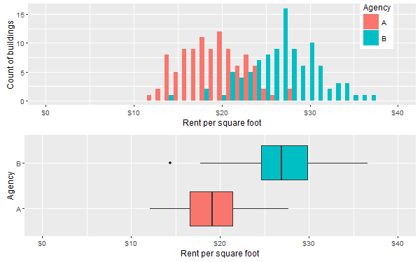
However, we cannot conclude from this picture that agency B is overspending on rent. We can only claim agency B is overspending if we can somehow control for the explanatory variable that is location.
Naïve solution: Filter to a particular location, e.g. county, city, zipcode, etc, and compare costs between federal agencies in that location only. For example we could compare rents between office buildings in downtown Raleigh, NC. This gives us a good comparison at a micro level but we lose the macro nationwide picture. Filtering through every region one by one to view the results is not a serious option when there are thousands of different locations.
I once worked with a client that had exactly this problem. Whenever an effort was made to compare costs between agencies, it was always possible (inevitable even) for agencies to claim geography as a legitimate excuse for apparent high costs. I came up with a novel approach for comparing costs at an overall national level while controlling for geographic variation in costs. Here is a snippet of some dummy data to demonstrate this example (full dummy data set available here):
| Agency | Zip | Sqft_per_zip | Annual_Rent_per_zip ($/yr) |
| G | 79101 | 8,192 | 33,401 |
| D | 94101 | 24,351 | 99,909 |
| A | 70801 | 17,076 | 70,436 |
| A | 87701 | 25,294 | 106,205 |
| D | 87701 | 16,505 | 70,275 |
| A | 24000 | 3,465 | 14,986 |
As usual I make the full dummy data set available here and you can access my R code here. The algorithm is described below in plain English:
- For agency X, compute the summary statistic at the local level, i.e. cost per sqft in each zip code.
- Omit agency X from the data and compute the summary statistic again, i.e. cost per sqft for all other agencies except X in each zip code.
- Using the results from steps 1 and 2, compute the difference in cost in each zip code. This tells us agency X’s net spend vs other agencies in each zip code.
- Repeat steps 1 to 3 for all other agencies.
The visualization is key to the power of this method of cost comparison.

This plot could have been generated in R but my client liked the interactive dashboards available in Tableau so that is what we used. You can download Tableau Reader for free from here and then you can download my Tableau workbook from here. There is a lot of useful information in this graphic and here is a brief summary of what you are looking at:
The height of each bar represents the cost difference between what the agency pays and what neighboring agencies pay in the same zip code. If a bar height is greater than zero, the agency pays more than neighboring agencies for rent. If a bar height is less than zero, the agency pays less than neighboring agencies. If a bar has zero height, the agency is paying the same average price as its neighbors in that zip code.
There is useful summary information in the chart title. The first line indicates the total net cost difference paid by the agency across all zip codes. In the second title line, the net spend is put into context as a percentage of total agency rent costs. The third title line indicates the percentage of zip codes in which the agency is paying more than its neighbors – this reflects the crossover point on the chart, where the bars go from positive to negative.
There is a filter to select the agency of your choice and a cost threshold filter can be applied to highlight (in orange) zip codes where agency net spend is especially high, e.g. a $1/sqft net spend in a zip code where the agency has 1 million sqft is costing more than a $5/sqft net spend in a zip code where the agency has only 20,000 sqft.
The tool tip gives you additional detailed information on each zip code as you hover over each bar. In this screenshot zip code 16611 is highlighted for agency B.
At a glance we get a macro and micro picture of how an agency’s costs compare to its peers while controlling for location! This approach to localized cost comparison provided stakeholders with a powerful tool to identify which agencies are overspending and, moreover, in precisely which zip codes they are overspending the most.
Once again, the R code is available here, the data (note this is only simulated data) is here and the Tableau workbook is here. To view the Tableau workbook you’ll need Tableau Reader which is available for free download here.
