Logistic Regression – Classification’s Bread & Butter

The R code for this analysis is available here and the (completely fabricated) data is available here.

Background – Where Does Logistic Regression fit within Machine Learning?

Machine learning can be crudely separated into 2 branches:

I had a graphic in A very brief introduction to statistics (slide 8) which highlighted the distinction within supervised learning between regression and classification. Here it is again.

Classification vs regression

Top of the list of classification algorithms on the left is good old “logistic regression” developed by David Cox in 1958. There is an inside joke in the data science world that goes something like this:

Data scientists love to try out many different kinds of models before eventually implementing logistic regression in production!

It’s funny cos it’s true! Well, kinda true. Logistic regression is popular because it is robust (in that it tends to give a pretty good answer even if the logistic regression assumptions are not strictly adhered to) and it is extremely simple to build in production (the end result is just a simple formula which is easy compared to the complex output of a neural net or a random forest). So you need to make a really strong case to justify moving away from the tried and trusted logistic regression approach.

Without further ado, let’s jump into an example!

Loan Application Example

Say we had the following loan application data. These loan applications have been reviewed and approved/denied by lending experts. As an experiment, your boss wants to develop a quick response loan process for small loan requests and she asks you to develop a model.

data table

Correlation Analysis

In this data set it looks like Credit Score and Loan Amount are two useful variables that influence the outcome of a loan decision. Let’s run a quick analysis to see how they correlate with loan decisions.

correlation matrix

Credit score has a positive correlation, 0.689, with loan decision – that makes sense – the higher your credit score, the greater your chances of being approved for a loan. But loan amount has a negative correlation, -0.500,  with loan decision – this also makes sense – most banks will probably lend anyone 200 bucks without much fuss but if I ask for $50,000 that’s a different story!

Simple Model – One Predictor Variable

Credit score is most highly correlated with loan decision so let’s first build a logistic regression model using only credit score as a predictor.

One variable

The equation of this curve takes the following form:logistic curve equation

and the coefficients can be deduced from the logistic regression summary
one variable summary

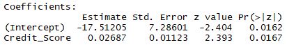
where β0 = -17.51205 and β1 = 0.02687.

But perhaps a more intuitive way of writing the same function is as follows:

logistic function

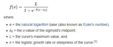
In our example: x0 = (-β0 / β1) = (-17.51205 / 0.02687) = 651.7, and L = 1.0, and k = 0.02687. I prefer this form of the equation because it more easily relates to the chart where we can clearly see that at a credit score of about 651.7 the probability of a loan being approved is precisely 0.5. If credit score was the only data you had and someone demanded a yes/no answer from you, then you could reduce the model to:

IF credit score ≥ 652 THEN approve ELSE deny

Of course it would be a shame to reduce the continuous output of the logistic regression to a binary output. Any savvy lender should be interested in the distinction between a 0.51 probability vs a 0.99 probability – perhaps someone with a high credit score gets a lower rate of interest and vice-versa rather than a crude approve/deny outcome.

Model Performance with One Predictor Variable

The performance of this model can be assessed by looking at the confusion matrix output and/or by coloring in the classifications on the chart.

confusion matrix

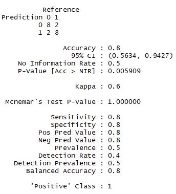
The confusion matrix terms can be a little (ahem) confusing, it’s best not to get too bogged down with them as I discussed here but looking at the balanced accuracy is a decent rule-of-thumb.

In other domains you may want to pay more careful attention if there is a significant real cost difference between false positives and false negatives. For example, say you have a sophisticated device to detect land mines, the cost of a false negative is very high compared to the cost of a false positive.

On the chart below we can compare the classification results to the confusion matrix and confirm that the model does indeed have 2 false positives and 2 false negatives.

classification

Slightly More Complex Model – Two Variables

Let’s now go back and include the second variable: Loan Amount. Remember Loan Amount had a negative correlation – the larger the loan amount, the lower the likelihood of approval.

Two variables

Because we have an extra dimension in this chart, we use different shapes to indicate whether a loan was approved or denied. We can see there are still two false negatives but there is now only one false positive – so the model has improved! The balanced accuracy has increased from 0.80 to 0.85 – yaaay! 🙂

Visualizing the Logistic Regression Partition

We can sorta make out the partition when we look at the chart above but with only 20 data points it’s not very clear. For a clearer visual of the partition we can flood the space with hundreds of dummy data points and produce a much clearer divide.

Logistic regression partition

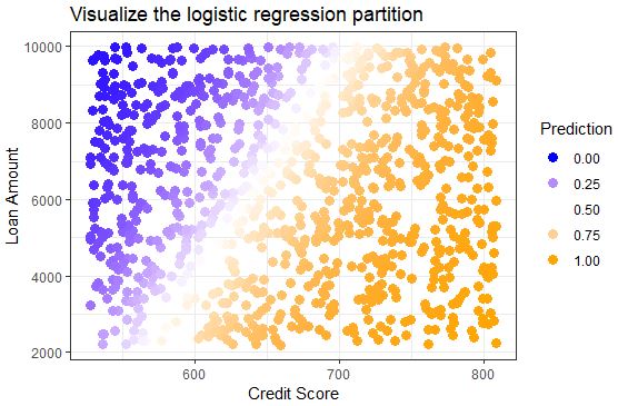
We used a continuous color scale here to show how the points close to the midpoint of the sigmoid curve have a less clear classification, i.e. the probability is around 0.5. But we still can’t really see the curve in this visual – we have to imagine the orange points in the bottom right are higher (probability) than the blue points in the top left and all of the points are sitting atop a sigmoidal plane and the inflection point of the sigmoid runs along the partition where prediction probability = 0.5.

Using a 3-dimensional plot we can clearly see the distinctive sigmoid curve slicing through the space.

giphy-1

It is important to note that you don’t need to generate any of these visualizations when doing logistic regression and when you have more than 2 variables it becomes very difficult to effectively visualize. However, I have found that going through an exercise like this helps me achieve a richer understanding of how a logistic regression works and what it does. The better we understand the tools we use, the better craftspeople we are.

The R code for this analysis is available here and the (completely fabricated) data is available here.


Pies are for eating

Bar charts beat pie charts almost every time – I say almost because I am open to being convinced … but I won’t be holding my breath.

Disadvantages of pie charts:
–          pie slices ranking is difficult to see even if attempted
–          rely on color which is an extra level of mental effort for the viewer to process
–          colors are useless if printed in black and white
–          difficult to visually assess differences between slices
–          3-D is worse because it literally makes the nearest slice look bigger than it should be

Advantages of bar charts:
–          easier to read
–          no need for a legend
–          we can rank the bars easily and clearly
–          easy to visually assess difference

If you google “pie charts” you’ll find a bunch of people ranting far worse than me. Here is a good collation of some of the best arguments.

All that being said, data visualization is a matter of taste and personal preference does come into it. At the end of the day it’s about how best we can communicate our message. I wouldn’t dare say we should never use pie charts but personally I tend to avoid them.

Localized real estate cost comparison

Comparison of real estate costs across different regions presents a challenge because location has such a large impact on rent and operation & maintenance (O&M) costs. This large variance in costs makes it difficult for organizations to compare costs across regions.

“There are three things that matter in property: Location, location, location!” British property tycoon, Lord Harold Samuel

For example, imagine two federal agencies, each with 100 buildings spread across the US. Due to their respective missions, agency A has many offices in rural areas, while agency B has many downtown office locations in major US cities.

simple-comparison
Agency B has higher rent costs than agency A. This cost difference is largely explained by location – agency B offices are typically in downtown locations whereas agency A offices are often in rural areas. To truly compare costs we need to control for location.

However, we cannot conclude from this picture that agency B is overspending on rent. We can only claim agency B is overspending if we can somehow control for the explanatory variable that is location.

Naïve solution: Filter to a particular location, e.g. county, city, zipcode, etc, and compare costs between federal agencies in that location only. For example we could compare rents between office buildings in downtown Raleigh, NC. This gives us a good comparison at a micro level but we lose the macro nationwide picture. Filtering through every region one by one to view the results is not a serious option when there are thousands of different locations.

I once worked with a client that had exactly this problem. Whenever an effort was made to compare costs between agencies, it was always possible (inevitable even) for agencies to claim geography as a legitimate excuse for apparent high costs. I came up with a novel approach for comparing costs at an overall national level while controlling for geographic variation in costs. Here is a snippet of some dummy data to demonstrate this example (full dummy data set available here):

Agency Zip Sqft_per_zip Annual_Rent_per_zip ($/yr)
G 79101 8,192 33,401
D 94101 24,351 99,909
A 70801 17,076 70,436
A 87701 25,294 106,205
D 87701 16,505 70,275
A 24000 3,465 14,986

As usual I make the full dummy data set available here and you can access my R code here. The algorithm is described below in plain English:

  1. For agency X, compute the summary statistic at the local level, i.e. cost per sqft in each zip code.
  2. Omit agency X from the data and compute the summary statistic again, i.e. cost per sqft for all other agencies except X in each zip code.
  3. Using the results from steps 1 and 2, compute the difference in cost in each zip code. This tells us agency X’s net spend vs other agencies in each zip code.
  4. Repeat steps 1 to 3 for all other agencies.

The visualization is key to the power of this method of cost comparison.

agency-b-screenshot
Screenshot from Tableau workbook. At a glance we can see Agency B is generally paying more than its neighbors in rent. And we can see which zip codes could be targeted for cost savings.

This plot could have been generated in R but my client liked the interactive dashboards available in Tableau so that is what we used. You can download Tableau Reader for free from here and then you can download my Tableau workbook from here. There is a lot of useful information in this graphic and here is a brief summary of what you are looking at:

The height of each bar represents the cost difference between what the agency pays and what neighboring agencies pay in the same zip code. If a bar height is greater than zero, the agency pays more than neighboring agencies for rent. If a bar height is less than zero, the agency pays less than neighboring agencies. If a bar has zero height, the agency is paying the same average price as its neighbors in that zip code.

There is useful summary information in the chart title. The first line indicates the total net cost difference paid by the agency across all zip codes. In the second title line, the net spend is put into context as a percentage of total agency rent costs. The third title line indicates the percentage of zip codes in which the agency is paying more than its neighbors – this reflects the crossover point on the chart, where the bars go from positive to negative.

There is a filter to select the agency of your choice and a cost threshold filter can be applied to highlight (in orange) zip codes where agency net spend is especially high, e.g. a $1/sqft net spend in a zip code where the agency has 1 million sqft is costing more than a $5/sqft net spend in a zip code where the agency has only 20,000 sqft.

The tool tip gives you additional detailed information on each zip code as you hover over each bar. In this screenshot zip code 16611 is highlighted for agency B.

At a glance we get a macro and micro picture of how an agency’s costs compare to its peers while controlling for location! This approach to localized cost comparison provided stakeholders with a powerful tool to identify which agencies are overspending and, moreover, in precisely which zip codes they are overspending the most.

Once again, the R code is available here, the data (note this is only simulated data) is here and the Tableau workbook is here. To view the Tableau workbook you’ll need Tableau Reader which is available for free download here.


Geographic Information Systems

Geographic information system is a clunky term for what the layman simply calls maps. Ok, ok, there is more to it than that with shapefiles and polygons and metadata, etc, etc. But the general gist is a visualization of geographical data and this challenge has been tackled for aeons, or at least for a long time before data-viz became trendy. In 2012, Tableau put together what they consider to be The 5 Most Influential Data Visualizations of All Time and I was not surprised to see John Snow’s Cholera Map of London in the mix as well as Napoleon’s March on Moscow (which is kinda sorta GIS mapsy).

Personally, I cut my teeth in GIS as a young civil engineer when I worked in the Irish sewerage and rain water drainage industry – this Wad River Catchment Flood Study (pdf) includes some elegant geographic visualizations that I helped develop. Being a an engineer during the Irish property bubble I witnessed a lot of housing construction in areas where there was subsequently little or no demand. Depending on who you talk to this was either due to greedy bankers, over-exuberance in the market or a myriad of other explanations that spew from experts’ mouths. Given my proximity to the construction industry I was keenly aware of various tax incentives that were on offer for building houses in certain geographic areas and I suspected these government interventions, although well-intentioned, may have had a negative impact.

In 2012 I analyzed the National Unfinished Housing Developments Database to see if there was a link between government incentives and ghost estates. The results of my geographic analysis indicate that, yes, there is some evidence to suggest that the government exacerbated the housing bubble/bust for the very areas they were trying to help. My analysis was crude but compelling (if I do say so myself!)