Meetings: Making the most of a bad situation

I don’t like meetings. Too often they are a waste of my time. I think Dilbert agrees! Meetings are like pretend work, the full calendar and the flurry of activity gives the illusion of productivity even though the output from many meetingmongers is low. But I must begrudgingly admit that meetings are a necessary evil in my workplace. At the very least we need to communicate progress (or lack thereof) and status to stakeholders. So if you must call or attend a meeting, and sometimes you must, here are some tips for a smoother ride:

  1. Focus on other people in the group, in particular the key stakeholders like your client or boss. Ask yourself what do they need to get out of this meeting rather than what do you need. Listen to them and if you communicate everything clearly the meeting might be cut short and you could save yourself the dreaded “follow-up meeting”.
  2. Agendas are important but we often don’t have time to create one. As a minimum state the purpose and outcomes for the meeting. This could be as short as one sentence each and if nothing else it will help you to focus. If someone else set the meeting without an agenda and you have no idea what the purpose and desired outcome are – be ballsy and politely ask them.
  3. Don’t assume people read attachments you send them before meetings. Do you read every attachment sent to you? Of course not! Be respectful and highlight the top three issues – interested parties can read further if they like.
  4. If attendees are new to the location give clear and concise instructions regarding parking, traffic, building layout, etc. This saves time for everyone. You don’t want people turning up late and flustered, disrupting proceedings and requiring a repeat of issues already discussed.
  5. A quick roll call for key attendees can be helpful and, if the group is new, a rapid icebreaker can help people to connect. But if it’s a recurring meeting, introductions can quickly become banal.
  6. Stay focused on the meeting outcome. It might even help to start from there and work backwards.
  7. A short meeting is a good meeting. Everyone is happy when a meeting finishes earlier than the stated end time. Reverse is also true. Give yourself a little buffer time – like airlines do!
  8. Try, really try hard, to not call a meeting unless necessary.
Extreme analytics: anomalies and outliers

Ask ten people how they define outliers (aka anomalies) and you’ll get ten different answers. It’s not that they are all wrong it’s just that the term outlier can mean different things to different people in different contexts.

“A data point on a graph or in a set of results that is very much bigger or smaller than the next nearest data point.” from the Oxford English Dictionary.

Sometimes we want to detect outliers so we can remove them from our models and graphics. This does not mean we completely disregard the outliers. It means we set them aside for further investigation.

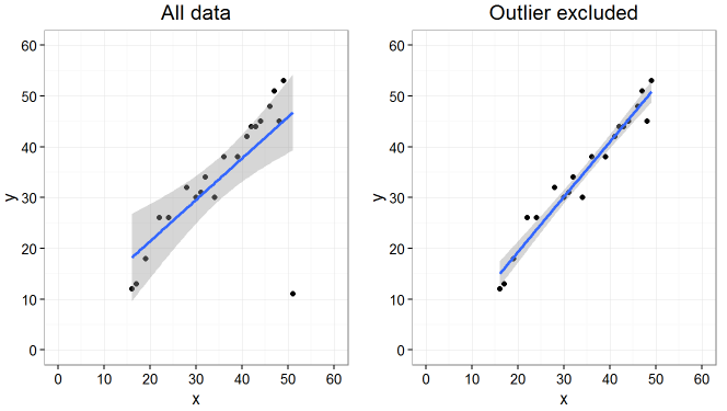
outlier regression example
This simple regression model fits tighter when the outlying data point is removed. Outliers should be investigated and not just removed because they don’t fit the trend.

On other occasions we want to detect the outliers and nothing else, e.g. in fraud detection. Regardless of what analytics project we are engaged in, outliers are very important so we have to come up with some techniques for handling them. The surest way to identify an outlier is with subject matter expertise, e.g. if I am studying children under the age of five and one of them is 6 foot tall, I don’t need statistics to tell me that is an outlier!

So what? Data practitioners don’t always have the luxury of subject matter expertise so we use heuristics instead. I will outline three simple univariate outlier detection methods and why I think the boxplot method outlined by NIST is the most robust method even though it involves a little more work.

The three methods are:

  1. Percentiles, e.g. flag values greater than 99th percentile.
  2. Standard deviations (SD), e.g. flag values more than 2*sd from the mean.
  3. Boxplot outer fence, e.g. flag values greater than the third quartile plus 3 times the interquartile range.

I generated dummy graduate salary data with some select tweaks to see how well each of these methods perform under different data distribution scenarios.

Scenario 1: Normally distributed data

n = 1,000, mean = $50,000, sd = $10,000. Below is a summary of the data including the distribution of the data points and a density curve.

##    Min. 1st Qu.  Median    Mean 3rd Qu.    Max. 
##   16040   43270   49600   49730   56160   81960
s1
Scenario 1: Normally distributed data

Notice that the SD and percentile methods are too sensitive, i.e. they are flagging values that may be high but are nonetheless clearly part of the main distribution. This is an example of false positive outlier detection. The boxplot outer fence detects no outliers and this is accurate – we know there are no outliers because we generated this data as a normal distribution.

Scenario 2: Skewed data

Now let’s stick an outlier in there. Let’s imagine one graduate in the group struck it lucky and landed a big pay packet of $100k (maybe it’s his uncle’s company or maybe he’s really talented, who knows)!

##    Min. 1st Qu.  Median    Mean 3rd Qu.    Max. 
##   16040   43300   49630   49800   56180  100000
s2
Scenario 2: Skewed data

Once again we see the SD and percentile methods are too sensitive. The boxplot method works just right, it catches the one outlier we included but not the rest of the normally distributed data.

Scenario 3: Even more skew

A handful of graduates came up with some awesome machine learning algorithm in their dissertation and they have been snapped up by Silicon Valley for close to $500k each!

##    Min. 1st Qu.  Median    Mean 3rd Qu.    Max. 
##   16040   43330   49650   51960   56310  554200
s3
Scenario 3: Even more skew

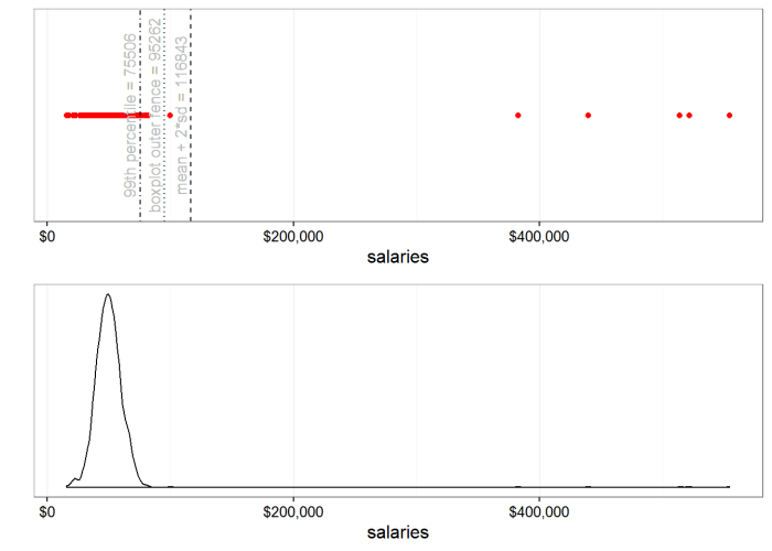
Now with a handful more outliers, the SD threshold has moved to the right so much that it surpassed our $100k friend from scenario 2. He is now a false negative for the SD method. The percentile method is still too sensitive but the boxplot method is coming up goldilocks again.

Scenario 4: Percentile threshold on the move

In the first three scenarios the 99th percentile threshold hardly budged. Because simply put: n = 1,000 and so the 99th percentile represents the 10th highest value. Since we have only added 6 outliers, the 10th highest value is still in the main distribution. So let’s add 10 more outliers (for a total of 16) and see what happens to the percentile threshold.

##    Min. 1st Qu.  Median    Mean 3rd Qu.    Max. 
##   16040   43430   49830   54200   56630  554200
s4
Scenario 4: Percentile threshold on the move

Boom. The 99th percentile threshold has jumped from being too sensitive (too many false positives) to a point where it is not sensitive enough and it is missing some outliers (false negatives). Notice once again how robust the boxplot method is to skewed data.

Closing comments

  • Boxplot method is no silver bullet. There are scenarios where it can miss, e.g. bimodal data can be troublesome no matter which method you choose. But in my experience boxplot outer fence is a more robust method of univariate outlier detection than the other two conventional methods.
  • These methods are only good for catching univariate outliers. Scroll back up to the very first chart in this piece and note that the “outlier” is not really an outlier if we only look at x or y values univariately. Detecting outliers in multidimensional space is trickier and will probably require more advanced analytical techniques.
  • The methods discussed here are useful heuristics for data practitioners but we must remind ourselves that the most powerful outlier detection method is often plain old human subject matter expertise and experience.

The R markdown script used to produce these examples and graphics is available for download from Google Drive here.